You’ve spent good money on your law firm’s website. It’s beautiful. It features high-resolution graphics, an intuitive user experience, and all the information your prospective clients need.
But does it convert?
Do your website visitors become clients? If not, you may be wasting your marketing and advertising budget.
Luckily, the solution is simple: You need to be using landing pages.
In this article, we’ll give you everything you need to know about effective landing pages for the legal industry.
We’ll break down:
3 ways your law firm can use landing pages
- Converting traffic from advertising
- Converting traffic from search
- Converting traffic from within your website
5 essential landing page best practices
- Adding video
- Using conversion-oriented design
- Optimizing your thank-you page
- Running A/B tests
- Featuring testimonials
Analysis of a law firm landing page
What are landing pages?
A landing page is a dedicated page on your law firm’s website that is focused on a single conversion goal. Simply put, a landing page is where a user “lands” after clicking on a link.
Landing pages can be used for a specific promotion, service line, or message that you want to send to your clients and prospective clients. Users arrive at a landing page after following a link from a digital ad, social media, or email.
Ultimately, landing pages are about encouraging a visitor to take a specific action. For instance, you might prompt a visitor to subscribe to a newsletter, download a guide, or fill out a contact form.
The key to a good landing page is choosing a single, specific action you want users to take.
How can my law firm use landing pages?
Ultimately, landing pages should be used whenever you want to focus your website visitor’s attention on a single conversion goal.
That could be anything, so long as it’s specific. You might want users to subscribe to your blog, watch a video, download a guide, or directly book a consultation.
Because your landing pages are specific to the interests of your visitor, that means that you have to know what your website visitors are interested in. And the easiest way to determine that is to see where they’re coming from.
Converting traffic from advertising
If your website visitors clicked on an ad that read “Book a consultation with an immigration lawyer today,” you can be pretty confident that’s what they’re interested in.
But if you sent them straight to your website home page, they might get distracted by the other services you offer. They might click the “Family Law” tab in your navigation bar. Or they might see your “About Us” tab, which, while a valuable part of your website, doesn’t push visitors towards a consultation.
Or, in the worst-case scenario, they don’t immediately see what they’re looking for on your home page and they click away and go to one of your competitors.
Instead of sending them to your home page and hoping for the best, send them to a landing page created specifically for your ad campaign — a landing page that includes the same language, imagery, value proposition, and call-to-action as your ad.
For instance, here’s a Facebook ad example from The Crone Law Firm, PLC, in Memphis:
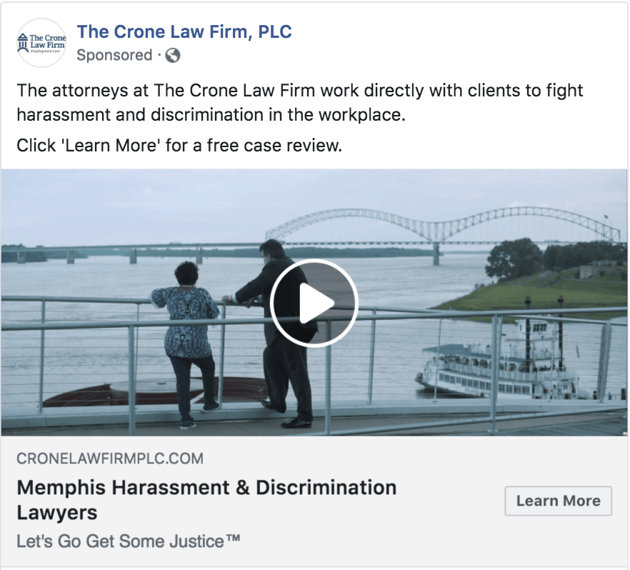
The landing page for this ad reiterates the messages and content. The core ad messaging, “[we] work directly with clients to fight harassment and discrimination in the workplace,” would be repeated in the corresponding landing page, with proof backing up this messaging in the form of bullet points, client testimonials and success stories:

The ad features a 30-second snippet of a video, which is just enough to give the viewer a taste of what to expect. On the landing page, the video is featured in a longer format, both as a CTA link above the fold and embedded in a player lower on the page.
Typically, landing page videos can be as long as two minutes, and ad videos should remain under one minute.
The landing page features a more specific call-to-action for a reader interested in becoming a client of the law firm: “Get Help Now” above the form.
Converting traffic from search
If your law firm is ranking for any organic search terms, you need to optimize your website accordingly.
When converting traffic from search, you want to be sure that your landing pages match up to what users are searching for. If you’re organically ranking for a particular service, you should create a dedicated landing page so searchers can easily find what they’re looking for.

Search queries are typically specific, such as “immigration lawyer near me,” or “motorcycle accident lawyer in Norcross.” These are called long-tail keywords, and are more specific phrases that users search. You have a better chance of ranking on long-tail keywords than short ones.
Your landing pages need to contain these phrases in order to rank organically.
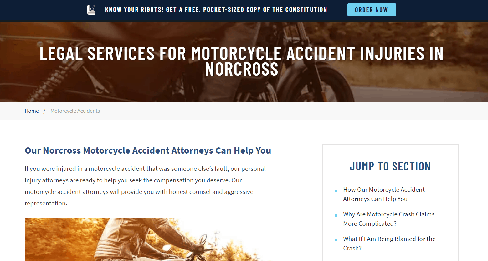
However, resist the urge to stuff your landing pages with keywords. Google rewards a good user experience over all else, and if your landing page appears to be a wall of keywords, you’re not offering any genuine value to page visitors and will likely be penalized in search results.
Converting traffic from within your website
Your website is designed to showcase your firm in its entirety. You likely have an about us page, a contact us page, pages that feature your legal specialties, pages that show off your past cases, and more.
In short, your website isn’t focused on any one thing. It’s focused on the big picture.
Your landing pages, however, are (by definition) focused. When visitors are on your site, visiting one of your landing pages from your homepage will focus their attention on your desired action (get in touch or request a case consultation, most frequently).
Including links to landing pages throughout your website can help guide the user journey and turn site visitors into clients.

Law firm landing page best practices
When it comes to building a great landing page for your law firm, there are some best practices that are universal to all industries, and there are some that are more specific to law firms.
This section will take a look at landing page best practices for your firm.
Law firm landing page best practice #1: Use conversion-oriented design
Good landing page graphic design is equal parts art and psychology — guiding the user through an experience optimized for conversion.
Simply put, good graphic designers and conversion-optimizers (yes, it’s a real job) understand the way their website visitors respond to specific visual cues and leverage those responses to improve conversion rates.
When designing your landing page, here are a few best practices that encourage on-page conversion.
- High-contrast, eye-catching color: Colors are the first signal you send a user. Use plenty of negative space and employ high-contrast colors to guide the eye towards your landing page’s conversion goal (the “book a consultation” button, for instance).
- Encapsulation: Encapsulation is the idea that a button is more interesting and eye-catching than an underlined link. Place specific text callouts and buttons in bordered boxes to make them stand out on the page.
- Directional cues: Both arrows and written directions such as “click here” and “scroll down” tell users what to do next. Stay subtle and helpful, but give your landing page visitors clear cues for what they should be doing on the page.
- Value-oriented headlines: When it comes to conversion, everything should be about your client and how you can help them. You’re not the hero of this story, the client is. Position your law firm as a guide who can help the client solve their problems.
- Limited copy: When visiting a landing page, the user is looking for specific information and an answer to their question. They don’t need your full firm history. Keep your landing page concise to maximize the chance the reader takes the conversion action and to avoid overwhelming them with text.
- Reduce external navigation and links: The point of a landing page is to get the user to take a specific action before navigating away. If you give too many links and alternate paths, you’re hurting the chances they’ll take that desired action.

Law firm landing page best practice #2: Add video
If a picture is worth a thousand words, an effective video is priceless.
Using videos on landing pages can increase conversions by 86%.
That’s huge. That could be the difference between a successful advertising campaign and a load of wasted ad budget.
But why?
Why is video so great on landing pages?
- It communicates information more quickly than text.
- It personalizes your visitor’s experience.
- It can evoke an emotional connection to your offer.
Compared to a photo, video allows you to make a more powerful personal connection with your audience and tell your story. Video isn’t subject to interpretation in the same way as text or photography.
You also have a great chance to use video to stand out from the crowd. Most law firms who use photography use stock photos. Site visitors can go photo-blind, and the sites they visit can become forgettable.
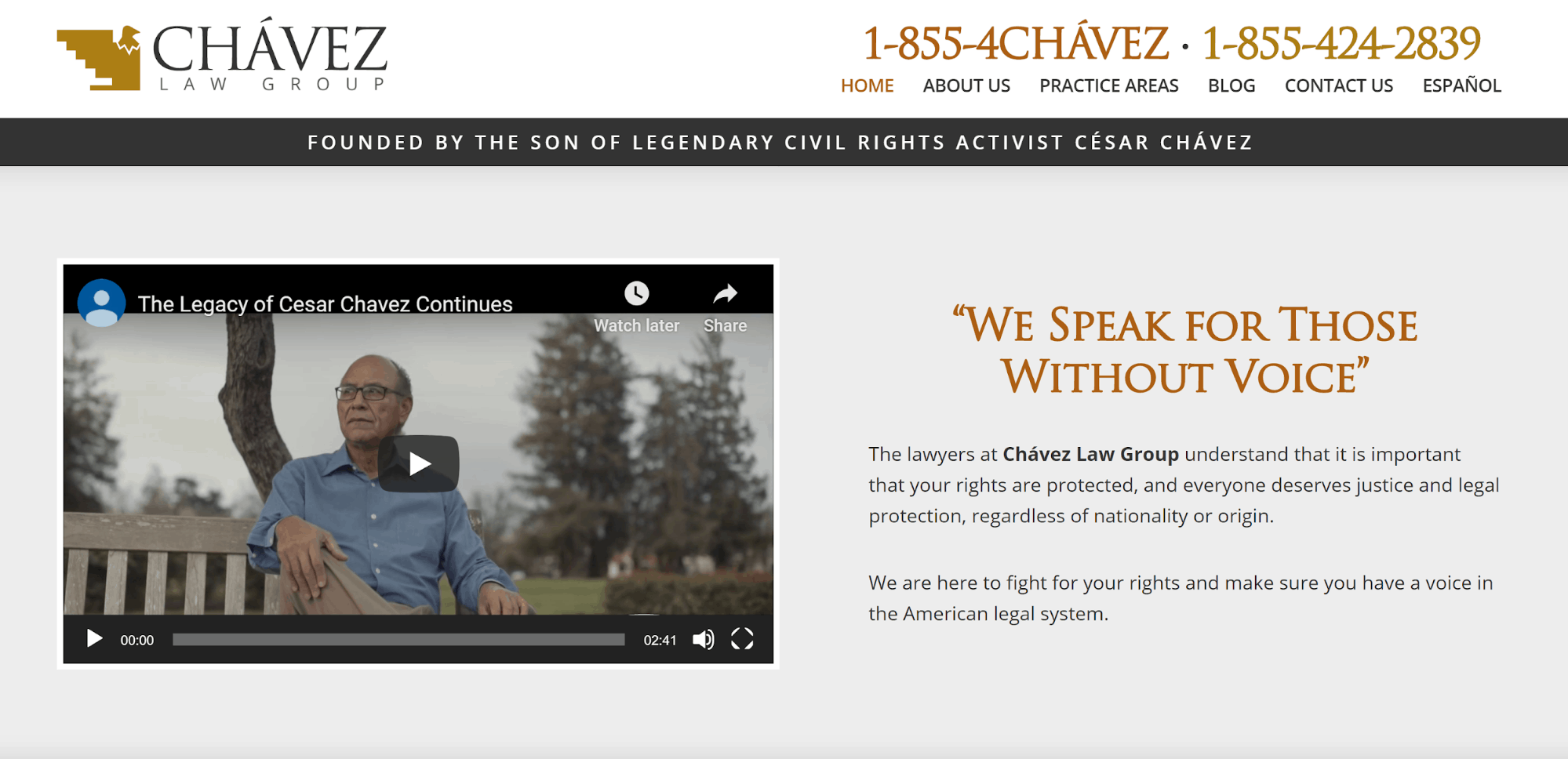
Note: It might be tempting to add a video background to your landing page, but we recommend you test (rather than implement) this strategy.
First off, if your landing page has a lot of copy on it, a moving background might distract your visitor’s eye. Too much motion can be overwhelming or off-putting.
Secondly, videos may increase your landing page’s load time. If you already have one on your page, adding one as your background might result in it loading slowly, which your visitors hate. Most website visitors will leave a website that takes more than 3 seconds to load.
Last but not least, using a moving background violates most widely-accepted accessibility best practices, and if done incorrectly, background video is considered ADA-noncompliant. The last thing any law firm wants is to get hit with a discrimination suit.
Law firm landing page best practice #3: Optimize the form
Your landing page most likely contains a form as part of the conversion action, whether it’s to sign up, download, or request a consultation.
The challenge you face is getting users to fill out that form.
Generally speaking, your form should be above the fold, meaning it’s fully visible before a user scrolls down the page.
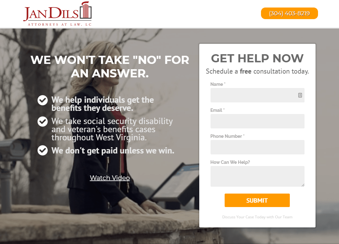
To maximize form completions, you want to make sure you aren’t asking for too much information.
It’s important to limit not only the number of fields but also the types of information you’re asking for. If you ask for too much information, or the information you ask for is too personal (such as an address), it’s unlikely that a user will complete the form.
Remember, though, to ask for the information you need to turn this new lead into a client.
For instance, if asking for a phone number reduces your landing page’s conversion rates by 10%, but improves your ability to turn that lead into a client by 25%, it may be worth it.
Law firm landing page best practice #4: Run A/B tests
A/B testing is the process of comparing two versions of a landing page to find what’s performing better.
For instance, you might run two landing pages that are identical, except one features a video and the other features a static image. You’d send 50% of your visitors to variation A, and 50% to variation B (thus “A/B” testing).
Another example would be testing the color of a button to see which hue spurs more visitors to take your desired action:

In this scenario, whichever variation outperforms the other after a set number of visitors and statistical significance should be shown to 100% of visitors.
Changing your website’s design as a result of user or split testing can increase your conversion rate by 400%.
You can continue A/B testing variables on your landing pages to ensure they’re completely optimized. Headlines, background color, form placement, CTA buttons, and so many other factors are all fair game for this type of testing.
The most important factor of an A/B test is that all other factors remain equal, and you’re only testing one variable at a time.
At a certain point, you might see a plateau in performance, which is normal. If you’ve done adequate testing and maximize your performance, it might make sense to start a new campaign with a different offer.
Law firm landing page best practice #5: Feature testimonials
To persuade your prospects to become clients, you need to prove your success not only in the courtroom but also in the court of public opinion.
Testimonials are the ultimate evidence of your reputation and success as a law firm. This phenomenon, known as social proof, reinforces to prospective clients that you’ve earned the trust of clients in situations like theirs.
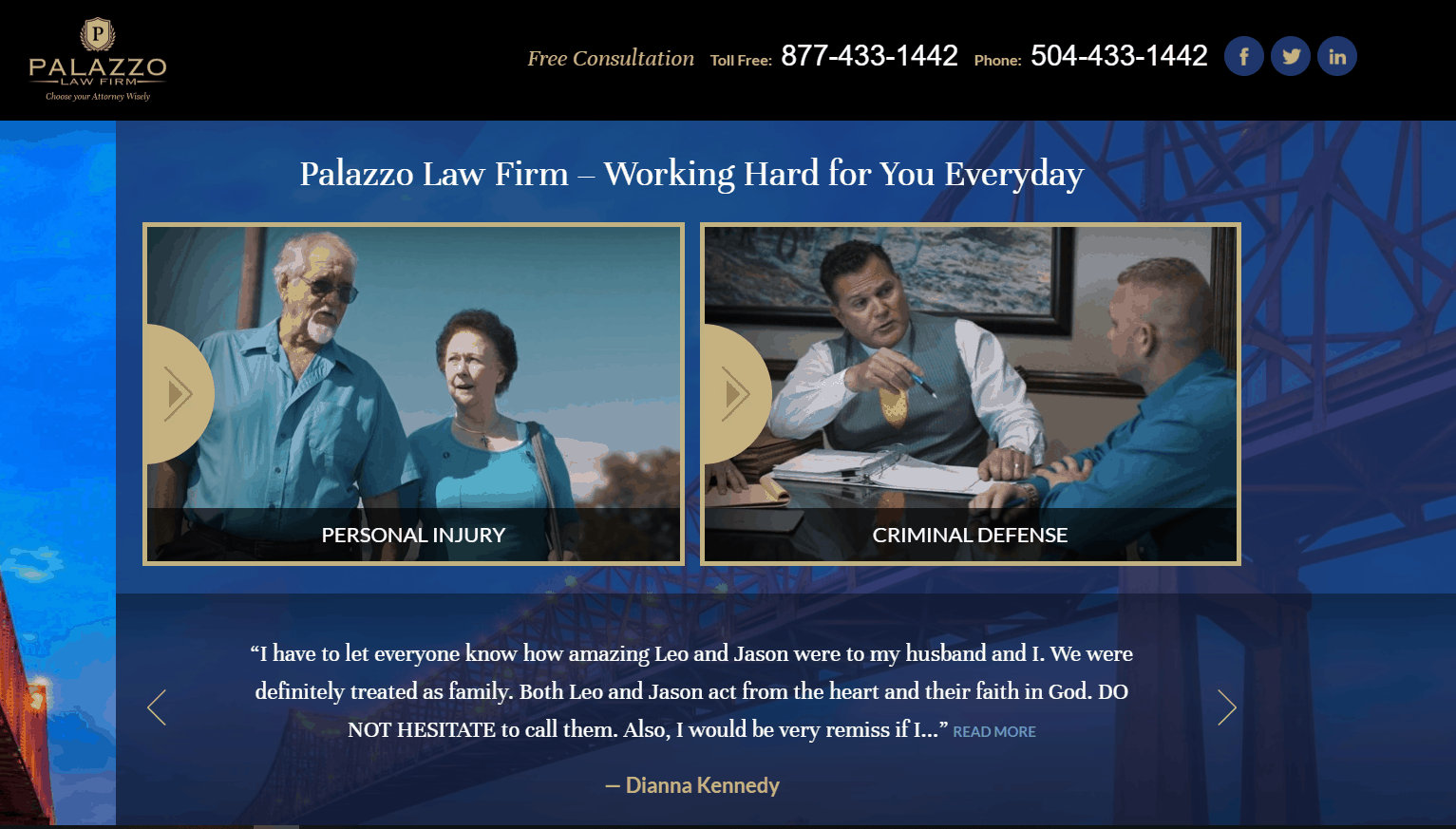
You want to show your prospects that you’re able to consider their unique case and fight for their specific best interests.
A video testimonial, in particular, can be a powerful motivator for prospective clients to book a call.
Here’s an example of a great law firm testimonial video that could be added to a landing page to improve the chance of a visitor completing your firm’s desired action:
Analysis of a law firm landing page
Sometimes the best way to learn is to see a real-world example.
So let’s take a look at a law firm landing page in the wild.
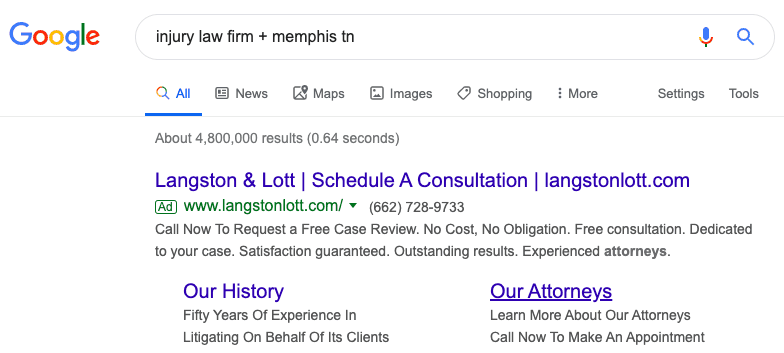
When you type “Injury lawyer + Memphis TN” into Google, here’s what appears:

Let’s take a look at the landing page for that top ad, from Langston & Lott:

What we’d test on this law firm landing page:
- Moving the form above the fold can help improve conversion rates. Most users will never reach the bottom of a page, and therefore are less likely to fill out the form.
- On the subject of the form, while the number of fields is probably correct, the direction to “Type your message here…” is extremely vague and unhelpful. “Tell us about your case…” might be more direct and informative.
- The text in the middle of the page is too long and isn’t specific to a user action. This would make great ‘About’ page content but doesn’t give the landing page visitor an idea of how this firm approaches injury cases.
- The navigation bar should be tested or removed altogether. Typically, landing pages omit the main navigation like this to keep the user focused on the conversion action.
- We’d add a high-contrast call-to-action button, placed above the fold, that tells the user what they should do. The navy blue “Submit” button disappears in the charcoal grey background — a white button might be more effective to draw user attention.
Conclusion
Hopefully you now have a better understanding of the role that landing pages can play in your law firm’s marketing strategy.
Like most digital marketing tactics, the key to a great landing page is to test, optimize, and retest. The digital landscape is constantly shifting, and you need to meet and exceed user expectations to make an impact.
To learn more about how you can turn your website visitors into clients, as well as how Crisp’s industry-leading team can help your law firm grow, reach out to our team today.
